

color ·
how to style ·
The Basics of Coordinating Colors
Do you ever find yourself confused with color?
If so, I want to give you some color coordination basics that you can begin to practice immediately. Remember finger painting in kindergarten? I don't... but someone reminded me that it was there that we were first introduced to the art of color and their relation to one another.
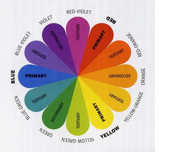
The Color Wheel
You must know what a color’s associations are and how they strengthen or soften each other. Once you understand these relationships you begin to see how well certain colors pair with each other. It’s not as simple as just MATCHING the same colors with each other. It gets tricky because there are combinations that are automatically pleasing to the eye and some that really clash. Some people may find this info boring, but it’s always the simple things that hold the most power when executed correctly. A lot of people have the “knowledge” but won't implement it.
For some of you this may just be a refresher.
So here are the basics of the color wheel…
There are three PRIMARY colors – BLUE, RED, and YELLOW.
Adding lightness and darkness to these primary colors forms all other colors.
Adding any of these two PRIMARY colors together gives you a SECONDARY color.
Primary + Primary = Secondary
Example:
Blue + Yellow = Green
Yellow + Red = Orange
Red + Blue = Violet
Then adding measures of light or dark to these colors creates different shades of color as well.
A TERTIARY color is when you mix a SECONDARY color with it’s adjacent PRIMARY color.
Examples:
Green + Blue or Yellow = Blue-Green or Yellow-Green
Orange + Red or Yellow = Red-Orange or Yellow-Orange
Violet + Blue and Red = Blue-Violet and Red-Violet
A lot of people have the “knowledge” but won't implement it.
For some of you this may just be a refresher.
So here are the basics of the color wheel…
There are three PRIMARY colors – BLUE, RED, and YELLOW.
Adding lightness and darkness to these primary colors forms all other colors.
Adding any of these two PRIMARY colors together gives you a SECONDARY color.
Primary + Primary = Secondary
Example:
Blue + Yellow = Green
Yellow + Red = Orange
Red + Blue = Violet
Then adding measures of light or dark to these colors creates different shades of color as well.
A TERTIARY color is when you mix a SECONDARY color with it’s adjacent PRIMARY color.
Examples:
Green + Blue or Yellow = Blue-Green or Yellow-Green
Orange + Red or Yellow = Red-Orange or Yellow-Orange
Violet + Blue and Red = Blue-Violet and Red-Violet
 With this in mind, adjusting amounts of primary colors combined with level of lightness or darkness can create any color in the universe.
PRIMARY and SECONDARY colors that are side-by-side on the color wheel are ANALOGOUS to each other.
Blue’s Analogous = Green and Violet
Orange’s Analogous = Red and Yellow
Analogous colors work well with each other. But only when they are matched according to the levels of light and darkness.
Primary and secondary colors that are opposite each other are COMPLIMENTARY.
Blue is complimentary to orange.
Violet to yellow.
Red to green.
And vice versa.
Pair these colors for a bolder statement. Be careful matching these though, as certain shades will not look good on each other.
I know this is only a small bit of information, but start with this.
1. Print out this color wheel.
2. Remember that Analogous colors work together, but make sure they are of similar value. As a basic color concept, “value” represents the degree of lightness or darkness expressed in every color.
3. Use complimentary colors for a bold statement. Matching complementary colors together is a sign of a confident, knowledgeable dresser, and doing so creates an impressive, color-rich palette.
4. As a general rule of thumb you don’t want to have more than THREE colors in your outfit. So pick three colors to match throughout your entire outfit. Any more than this and it starts getting risky.
5. Use the right colors for your skin tone and coloration. Try different colors against your skin and learn which palettes look best on you. Also, get a second opinion.
Never use holiday colors like red and green UNLESS it is close to that holiday.
Try to avoid gray colors with bright colors such as yellow. (however, I've seen this work well under certain conditions)
With this in mind, adjusting amounts of primary colors combined with level of lightness or darkness can create any color in the universe.
PRIMARY and SECONDARY colors that are side-by-side on the color wheel are ANALOGOUS to each other.
Blue’s Analogous = Green and Violet
Orange’s Analogous = Red and Yellow
Analogous colors work well with each other. But only when they are matched according to the levels of light and darkness.
Primary and secondary colors that are opposite each other are COMPLIMENTARY.
Blue is complimentary to orange.
Violet to yellow.
Red to green.
And vice versa.
Pair these colors for a bolder statement. Be careful matching these though, as certain shades will not look good on each other.
I know this is only a small bit of information, but start with this.
1. Print out this color wheel.
2. Remember that Analogous colors work together, but make sure they are of similar value. As a basic color concept, “value” represents the degree of lightness or darkness expressed in every color.
3. Use complimentary colors for a bold statement. Matching complementary colors together is a sign of a confident, knowledgeable dresser, and doing so creates an impressive, color-rich palette.
4. As a general rule of thumb you don’t want to have more than THREE colors in your outfit. So pick three colors to match throughout your entire outfit. Any more than this and it starts getting risky.
5. Use the right colors for your skin tone and coloration. Try different colors against your skin and learn which palettes look best on you. Also, get a second opinion.
Never use holiday colors like red and green UNLESS it is close to that holiday.
Try to avoid gray colors with bright colors such as yellow. (however, I've seen this work well under certain conditions)
 6. The monochromatic look is always safe.
Lighter and darker shades of the same color can often look good when matched, forming a monochromatic effect.
Keep these things in mind every time you dress yourself and start working on building this eye for color coordination TODAY.
SHOP FOR THREADS >>
6. The monochromatic look is always safe.
Lighter and darker shades of the same color can often look good when matched, forming a monochromatic effect.
Keep these things in mind every time you dress yourself and start working on building this eye for color coordination TODAY.
SHOP FOR THREADS >>